It has been two months in the making, and I’m finally on the other end of this portfolio builder class!
I also have my Github set up, and this is where I’ll be putting all of my other projects as well. Slowly working on building up my Git portfolio is a little nerve wracking, but I’m glad I’ve gotten here finally.
https://github.com/Katherine89Lee/Telco-Customer-Churn-EDA-and-Modeling
It’s hard to talk about this project without talking about all of the steps involved, which included me learning on my feet about machine learning and statistics and even getting into Python-based data visualizations. There really was a lot that I got from this class, but that will have to be its own blog post.
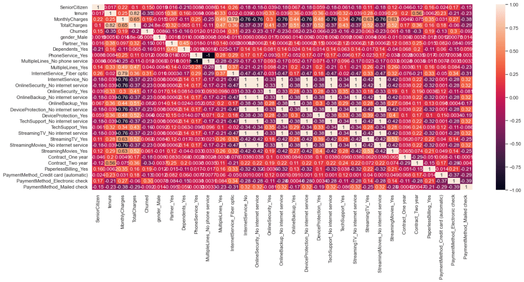
So far, the version that is on the Github repo is just EDA, but I got a little closer to modeling. I had to one-hot encode a lot of the categorical data to find the correlations through a heatmap and then I was able to find some valuable ways to model the data overall.
Originally I was going through tenure, because that was what I saw the strongest correlation of in the histogram. When I was able to figure out more ways to visualize the rest of the data, I saw other correlations as well.
The customer churn idea started from an analytics approach originally, because I misunderstood the assignment, but even with some pitfalls and dips with regards to the dataset in general, I was able to find a way to get to a model.
The model is going to come later this week. I’m a little nervous about the execution of it, but I have had a lot of very informative and impactful help from my teacher, Neslihan, and one of the other colleagues from the Cohort, Emi. They helped me understand what I could do with coding and to find shortcuts and easier ways to get where I wanted to go.
It also hadn’t occurred to me until all three of us were poking around my data, that the total charges column was being considered a string. We had to do some work to make it behave how it should have.
Of everything I learned, I think the heatmap is probably my favorite of the visualizations. ( I have it below ) Not just learning how to use it, but how to read it as well. It’s usefulness is unparallelled to me, because it can help you make a lot of findings, and is about as good as a chi squared test.
The model that I’ll be using for this is logistic regression. I know that with my experience with the ARIMA model, that models aren’t necessarily difficult to find the code for, and the training and testing needed for it can be pretty swift.
I’m trying not to make this sound like my readme, and it’s a little difficult! Last week, when I hit another roadblock, my teacher floated the idea of the project just being data analysis. I knew that doing the encoding for the categorical data would transform the dataset and make it easier for me to create a model, so I set off on that before sticking with making this just an EDA project.
Being someone who is still learning Python and data science and modeling, it was a little hard. I had the basic premise down to do get_dummies with Pandas, but then once the dummies were made, I wasn’t sure how to bridge that gap into finding correlations and doing a heatmap.
My teacher and colleague came to my rescue with code I hadn’t seen anywhere in all of the documentation I looked at, making it much easier for me to take the dummies and analyze them.
That’s the other thing I learned: shortcut code is going to be hard to find. So many of the code cells I used were not that long. I think the longest set of code I’ll end up using is for the model, which I need to set up for testing, training, and then running the model.
In the latest iteration of the github repo and notebook, you’ll see I’m setting up for the model and running predictions. I have it running for one variable so far, but need to run it for the others that showed correlation.
I still can’t believe I was able to do something like this. It took a long time and a lot of work and help from my teacher and class mate, but I’m really happy to see this mostly finished!
Thank you all for coming on this journey with me, and to my teacher Neslihan and my classmate Emi K for all of the help and learning more visualization in Python. It’s been an incredibly enriching eight weeks!

Leave a comment