By now you have a basic understanding of what you bring to the table from your previous career track. This is essentially an extension of that post, and I was a little hesitant to create this for that reason, but I still think it’s important.
These skills are things you’ll find across the board from Data Science to Engineering to basic Analysis. Whatever kind of career you’re considering, these are skills that will be valuable in any role.
Statistics
This seems obvious, but I wanted to mention it anyway. A basic understand of statistics and probability will go a long way in any role, especially if it gets into data science, where a majority of the position tends to focus on modeling.
Let me toot my own horn for a second (toot toot). Unless you already have a quantitative degree (maths, science, stats, econ, etc), doing a basic introduction to stats class can help you understand a lot of the different theories, concepts, and functions going on. The tooting my own horn comes in because I’m currently taking an intro to stats class, and it goes it starts and waves where I’ll have that knowledge that we’re going over, and sometimes, it’ll be all new to me.
Even if you just do a self-paced stats class a la Khan Academy, it’s still worth it to dive in and see what you’re missing, so you have a better understanding. Also so you can see some of the jargon and understand its meaning better.
I honestly think jargon is such a big part of getting lost in data career transition, but I digress, mostly because I already talked about that.
Visualization
We briefly touched on visualization in the first post of this series, but at its core, it is simply the display of data through graphs, line charts, bar charts, and any other ways you can think to communicate your findings.
Another piece of jargon I missed before– if you’re looking at one variable in a visualization, it’s univariate. More than one in a single viz is multivariate.
EDA – Exploratory Data Analysis- is done through visualizations and also, especially with pandas, with just getting a general feel of the data and what needs to be done to it. For me, visualization is the cornerstone of understanding what you have your hands in, before or after you clean the data.
Dashboarding
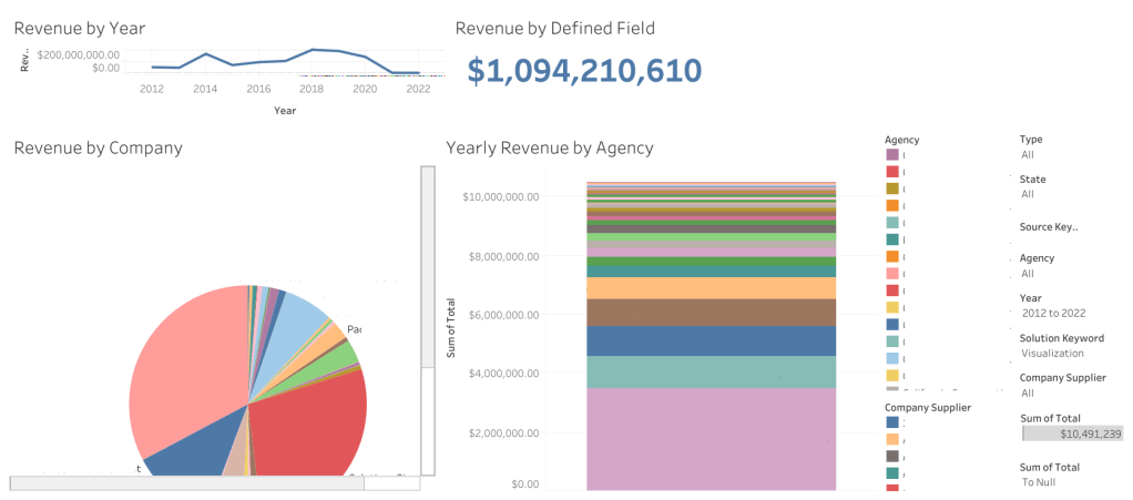
Dashboarding and visualization are essentially two sides to the same coin. Where visualization is individual graphs and charts that look at one or more variables, dashboards throw all those together in one beautiful spot.
Dashboards can be created in Tableau, Excel, PowerBI, and I believe Looker and Hadoop as well. I’ve used the first three but not the last two.
The advantage to dashboards can be interactivity. If you jump onto Tableau Public, you’ll see on the landing page side bar that there’s a viz of the day, which is a featured visualization created either as a dashboard or the story function. This was a big part of the project we were focused on for the residency program as well: creating something interactive that can change parameters and display information accurately given any selection.
I’ve found that creating dashboards can also be helpful with infographics, or showcasing findings from exploratory data analysis.
Presentations
Presentations are another one I touched on briefly in the first post of this series.
Presentations, along with vizzes and dashboards, help to communicate what you’ve found in the data after working with it and doing EDA for however long you’ve worked with it. You’ve gotten comfortable and intimate with this data, now you get to tell someone else you’ve seen it.
I admittedly bombed an interview once because I wasn’t aware I needed to *present* my presentation at the following interview. But the more I looked into it and tried to present it, the more I realized… It was just not set up well.
One of the bigger problems I had was that there was a lot of data, and it was hard to communicate it.
At the moment, I’m working on the finishing touches of my baseball analysis, and creating a presentation on it. The hardest part is breaking things down, going little by little, taking my time, but also not making it too slow or too difficult to understand.
There’s an art to this, and if you’ve done presentations before, you have a much better idea than I do about how to achieve that. Communication in general is incredibly important, and even though I have customer service skills to last me a lifetime, I’ve only just recently gotten the chance to work on my presentation skill with the residency program.
Presentations are a beast because it goes back to the concept of technical writing: you’re communicating something in your field of expertise, to someone who doesn’t understand all the jargon or everything going on.
Reports
Essentially a boiled down, non-visual presentation in a lot of ways.
Reports are broad. They can be anything from a report on your findings to a report on the data, to a CSV that gets downloaded as a report of people who signed in on a platform… There’s a lot that can be included in this.
Reports in general, in my opinion, are essentially a check in about where you are with the data and/or the progress of a project you’re on.
In my experience, we did a presentation to give the stakeholder an idea of where we were with what they had contracted us for– the residency program– and it was passed between a few hands to give the best understanding of both the ETL process and the dashboarding for those who did either.
Programming Languages
Of the languages I see mentioned constantly in different data roles, SQL, Python, and R are at the top. R has long since been a favorite stats language, one I have been trying to poke my nose into recently. Python is versatile and has probably a million (exaggeration) libraries that allow you to visualize and check out the data in a way that’s meaningful. SQL I spoke about in a previous blog post, it allows you to ask questions (queries) of the data directly.
Under the heading of Python are its most popular libraries for stats and data analysis: pandas, numpy, beautifulsoup, seaborn, and scikitlearn. If you don’t already use a SQL server for querying your data, you could also use SQLite3 in Python.
I did want to mention this, that if you’re doing viz with R and Python, these websites should be a huge help:
Python Graph Gallery – helped me really develop a better understanding of visualizations and what you can use for certain types of data.
R Graph Gallery – is the same but with R.
It’s worth mentioning that both have cheatsheets, and python graph gallery specifically has this link to caveats that will break your visualizations, and information on when to make certain chart types over others.
With programming, you’re likely to get errors. One of the best pieces of advice I can give you for this is to take the error call and put it in Google. Yes, seriously. Usually you’ll come up with a Stack Overflow thread that tackles the errors and how to fix them.
Googling things in general is a great way to find answers, if you don’t have other people to ask, when it comes to programming languages
Do not expect to remember everything off the top of your head. Programming is more about problem solving than remembering lines of code.
Honorable mention: Problem Solving
I feel like this is self explanatory, so it felt silly making it its own entry, but it does bear mentioning, because it is a cornerstone of analytics and working with data in general.
Certainly, problem solving with programming is one thing, where you’re creating scripts and programs and trying to make things run a certain way. Problem solving with data and in a data position is another, especially since you often times are given a problem before you get the data, and are told to figure out how to fix it.
Don’t be afraid to collaborate, or ask questions. Certainly if you need to do it alone, but reaching out to other people with a sanitized version of the problem and being able to hear a different perspective is possible, and helpful a lot of the time.
This was one of the harder things for me to get into, in the short period of time where I thought I might be into software development. The more code you have, the harder it might be to make it work. And just understanding what the code does can be hard, too, especially if you’re just starting out.
This will be especially true if you get into data science or data engineering, as data science tends toward models which can require complex code, and data engineering tends to employ Natural Language Processing to identify certain phrases or keywords to figure out what to clean and what to keep.
I hope that this was helpful! If you read the first entry as well, you know what you have already, and this will give you an idea of what to work on next just to get a feel for parts of the career.
The next post in the series will be about careers in data, role names, and a general idea of what’s included in them. I’m hoping for it to be an exhaustive list, to give a better idea of what’s out there, what’s possible, and to let you explore a little bit in case you’re unaware of certain opportunities that exist.
I have something to say about those possible opportunities, but I’ll save it for the next series post, and see you all then!

Leave a comment